
Solo and small attorneys face a unique challenge: balancing a professional appearance with limited time and resources. Your website provides the ideal opportunity for you to tell clients who you are, what you stand for, and to showcase your personality. When done right, it can be a powerful tool for building trust, generating leads, and converting visitors into clients. At TitleTap, we feature a wide variety of websites encompassing many niches in the legal field, providing our clients with individualized representation for their firm. To show you what we mean and to exemplify what we could do for your firm, consider the following excellent examples of some of the best small law firm websites by Title Tap.
What Makes a Great Law Firm Website?
Before diving into examples, let’s clarify what makes a website effective for solo practitioners:
- Mobile-Friendly and Fast: Your site needs to load quickly and look great on any device. Most visitors will first encounter your site via smartphone.
- Clear Messaging: Who you are, what you do, and how you help should be evident within a few seconds of landing on your homepage.
- Easy Navigation: Simplicity wins. Your most important pages (services, about, contact, and FAQs) should be easy to find.
- Trust Signals: Testimonials, reviews, bar association logos, and professional photography help establish credibility.
- Call-to-Action (CTA): Every page should encourage your visitor to take the next step, like scheduling a consultation or calling your office.
- Content That Educates: Informative blog posts, FAQs, and practice area pages help establish authority and improve SEO.
Standout Solo and Small Law Firm Website Examples
Dixit Law
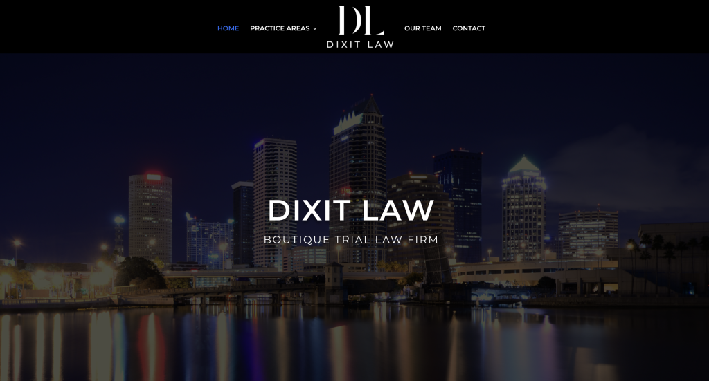
Known as the Boutique Trial Law Firm, Dixit Law’s website promotes luxury and style, which fits perfectly with their focus on real estate in the swanky Tampa, Florida area. Dixit Law also practices Business Law as well as other forms of litigation, in addition to offering real estate law services. This unique website shares the mission statement of the team and a welcome message to potential clients saying that this firm is committed to paying attention to the most minute details, which is how they aim to serve clients, through technology and innovative resources, all with a continued focus on customer service. The website exudes a sense of confidence communicated by Dixit Law while still being focused on getting clients to schedule a consultation and not hesitating to call the experts to help them through what is often a very stressful time dealing with a legal matter. The “our team” section features headshots and bios, introducing all potential clients to the team members that make up Dixit Law.
Richards Law, PA
Situated in Orlando, FL, Richards Law, PA focuses on real estate litigation and community association law. As a solo attorney, Jonathan Richards needed a site that communicated professionalism while being approachable to homeowners and HOAs. The homepage features clean design, strong branding, and a clear value proposition. CTAs like “Schedule Your Consultation” are placed prominently, and the copy reflects a deep understanding of the firm’s niche clientele. The layout is uncluttered, the services are clearly explained, and the site feels modern without being overwhelming. It speaks directly to its core audience.
Ganek PC
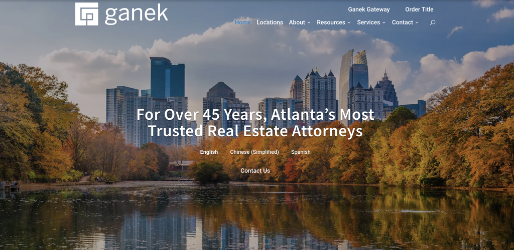
While Ganek PC has grown to multiple offices across Georgia, it maintains the personalized feel of a boutique legal team. The firm focuses on residential and commercial real estate law, title services, and closings. Their website communicates their experience clearly, with intuitive navigation and well-organized office pages tailored to different markets. The site balances scale with approachability. It features a modern, cohesive design with easy access to team bios, locations, and FAQs—everything agents, lenders, and homebuyers need to engage quickly. Even with multiple attorneys and offices, the site doesn’t feel overwhelming. It’s a strong example of how small firms can scale their digital presence without sacrificing clarity.
A Guide to Optimizing Your Law Firm’s Website
Learn how to optimize a law firm website to dominate search results and connect with qualified leads.
Vaughn Law
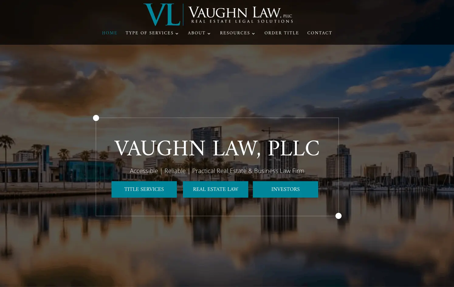
Vaughn Law’s website excels in its accessibility and navigation. The menu organizes the website in a logical way that’s visible from each page. Main menu tabs include: Home, type of services, about, resources, order title, and contact. The menu items each have a drop-down with appropriately organized sub-menus without being busy or overwhelming potential customers.
For example, the resources tab has a drop-down menu item titled: “Video library.” This helpful resource acts as a FAQ page that users can easily navigate and find the answers to their questions.
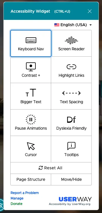
Possibly the most interesting part of the design is an accessibility widget at the bottom left of the page. This lets users toggle different options that make the website more user friendly such as making the font larger, changing the contrast, and converting copy to the dyslexia-friendly font.
Raulston & Associates
With a motto of protecting what matters, the focus picture of Raulston & Associates features a family holding hands. This heart-warming image calls to mind the service provided by this firm. The messaging on the site is clear and concise with focused phrases like who we are, what we do, and more.
With areas of practice including estate and will planning, business planning, real estate, charitable planning, and more, this website features many subcategories as well as an easy-to-navigate contact page, highlighted with the message “get in touch,” followed by contact information for their Chattanooga, TN and Trenton, GA locations. Therefore, clients will know their next step and can easily contact this firm to get help navigating their legal issues.
SEO Tip: Create Location-Specific Pages
Want to improve your visibility in local search? Creating individual pages for each location you serve—or practice areas tailored to a city—can help Google better understand your service areas. For example: “Real Estate Attorney in Tampa, FL” or “Family Law Services in Dallas, TX.”
Bessen Law
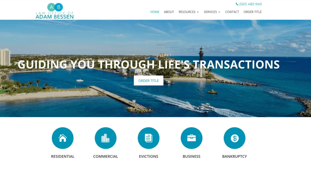
The primary strength of Adam Bessen’s website is its intuitive nature. The website includes all the essential elements on the homepage in a single scroll. Visual elements like icons can be easily scanned on the homepage that shows exactly what services are offered.
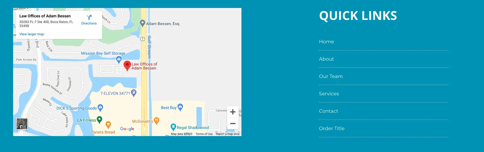
The top of the homepage within the featured image is a call-to-action to Order a Title (also the far-right option in the main menu.) The website’s main objective is to get the visitor to order a title, and there are multiple places to do so. It’s even included in the Quick Links menu at the bottom of every page.
June James Legal
As an intellectual property lawyer, June James Legal website highlights the message of “representing you when it matters most.” Promoting professional and personal legal expertise, this website features a sleek and professional appearance with beautiful Atlanta, GA (the firm’s location) as the backdrop photo. June James herself is prominently featured on the website’s home page with a professional headshot and her title of the managing partner. The site also features scrolling testimonials that highlight the experience that many pleased clients have had with June James Legal and her team.
The Ultimate Website Checklist for Small Law Firms
Make sure your website is saying and doing exactly what it should and offering a great first impression for your firm, with this checklist.
Marecki Law Firm
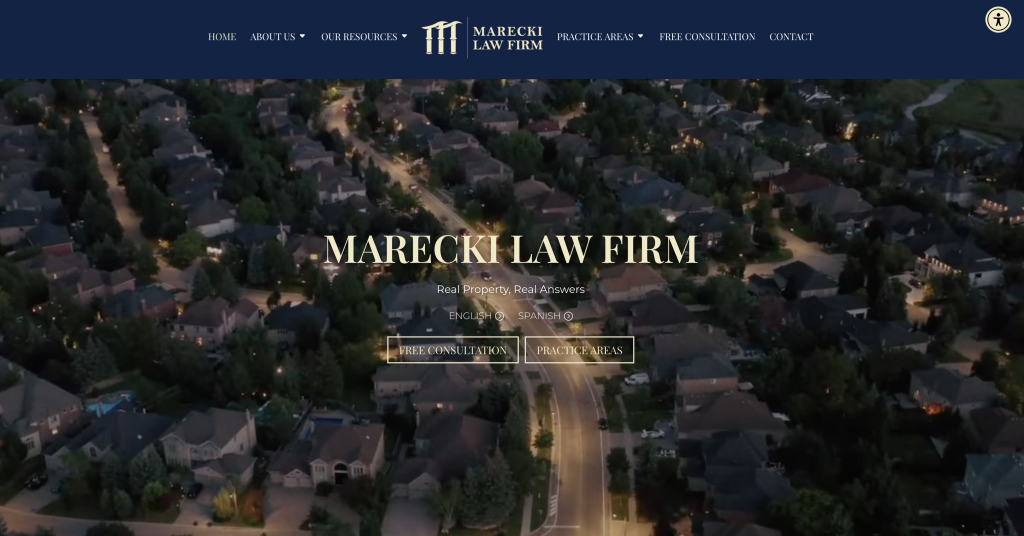
Known as a real estate firm that offers real answers regarding real estate, Marecki Law Firm at mylegaladvocate.com features a site in both English and Spanish, reaching even more potential clients. The aerial video that makes up the title page isn’t stagnant, but instead draws the eye through movement to a typical street of homes in the Lake Worth, Florida area.
The first message after the introduction is the “who we are” section, which begins with labeling their firm as a legal advocate in real estate law. They follow this up with the fact that they have orchestrated deals that amounted to more than $400 million to showcase their expertise in the area. The messaging of property being simultaneously a home and an investment is communicated throughout the website, showcasing the professionalism with a heart that the Marecki Law Firm offers.
Denelle Law
Representing clients throughout Massachusetts and Rhode Island, the website of Denelle Law, LLC is professional and personable. It begins by showing an arial video of the area and then moves into the various avenues of law practiced at the firm, including real estate law, estate planning and probate, business and corporate law, and personal injury law.
The welcome message on the site is a nice touch as it outlines the way that Denelle Law provides services to their clients, focusing on every detail and a desire to exceed client expectations, a message summed up with three words: honesty, integrity, and respect. This is followed up with client testimonials and firm partners, along with three language options for viewing the site, as well as links to the firm’s socials.
Lindenwoods Law Offices
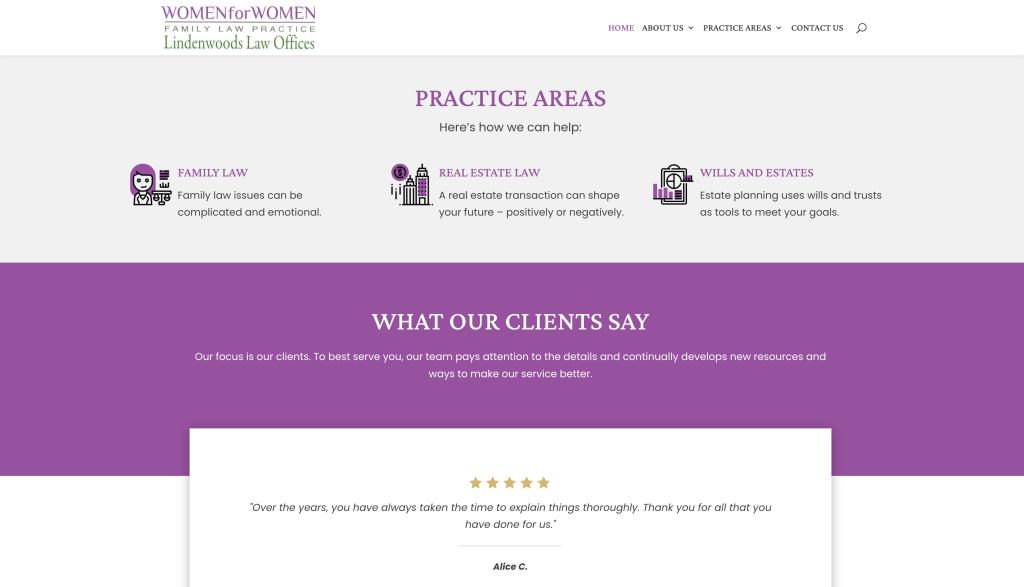
Legal expertise that is both personal and professional is the message that gets sent loud and clear by Lindenwood Law Offices, Women for Women Family Law Practice. By specializing in family law, real estate law and wills and estates, Lindenwood Law Offices represent clients when it matters the most.
Serving the Winnibeg, Canada areas, the site is available in both English and French. It also features a beautiful photo of several women’s hands combining to form a group, showcasing the power of women holding up women, which is, in essence, the message of this website. There is a prompt for a free consultation at the end of the site page, encouraging potential clients to learn more.
Turnkey Websites for Busy Attorneys
No matter the area of law you practice, TitleTap has current examples of well-performing websites that represent the very best in any legal arena. Whether you’re starting from scratch or refreshing your existing site, we can help you launch a website that looks great and converts! Contact us to learn more about how we can utilize our website building expertise and help you create a turnkey website with SEO features and social media content as well, all with a money-back guarantee. Schedule a demo today.

Experience TitleTap’s Difference!
Don’t settle for less! Join countless satisfied clients who have transformed their online presence with TitleTap. Enjoy awesome support, free redesigns, and a 60-day guarantee!